Checkboxes in Tkinter (GUI Programming) – Tkinter Tutorial
Checkboxes: Tkinter in python provides us vast number of widgets that we can use in our GUI applications. Out of which checkboxes or checkbuttons are one of the most commonly used widgets. It is used to implement on/off selection or operation. It (checkboxes or buttons) can contain images or text. When any specific checkbox is selected, Tkinter calls that method.
Syntax:
widget = Checkbutton(root, attributes)
root: It represents the parent window where we will place our checkbutton.
attributes: It represents the attributes, which we will used to control the properties of our widget.

Attributes of Checkbutton:
- activeforeground: It represents the foreground color of checkbutton when it is under the cursor.
- activebackground: It represents the background color of checkbutton when it is under the cursor.
- bg: This represents the normal background color of checkbutton.
- bd: This attribute used to set the border width of checkbutton. By-default, the width is 2px.
- command: This is used to set the function to be performed when checkbutton in action or the state of checkbutton is changed/interrupted.
- cursor: By using this option, we can change the pattern of cursor when it is over the checkbutton.
- font: This option used to change the font family or style properties for the text.
- height: It represents the number of lines to cover by the text on the checkbutton & it’s default value is set to 1.
- image: This option used to display a graphic image on the checkbutton.
- justify: It represents the properties of text is justified: CENTER, LEFT, or RIGHT.
- offvalue: This is an associated control variable that is set to 0 by default if the button is unchecked.But we can change the state of an unchecked variable to some other also.
- onvalue: This is an associated control variable that is set to 1 by default if the button is checked. But we can change the state of the checked variable to some other also.
- padx: It represent the amount of space to leave to the left and right of the checkbutton and text. Also it’s default value is 1 pixel.
- pady: It represent the amount of space to leave to the up and below of the checkbutton and text. Also it’s default value is 1 pixel.
- relief: It is basically a type of border style of checkbutton and it’s default value is set to FLAT. We also have some other border style properties of checkbutton i.e sunken etc.
- selectcolor: It represent the color of the checkbutton when it is selected and the Default is selectcolor=”red”.
- selectimage: This property is used to show the particular image when checkbutton is selected.
- state: It is used to represent the state of the checkbutton. By default, its state is set to normal. But we can change it to DISABLED to make the checkbutton unresponsive i.e user not able to perform any operation on that checkbutton. And the state of the checkbutton is ACTIVE when it is under the focus.
- underline: This option used to underline the character. The indexing of character starts with zero in the text.
- variable: It represents the associated variable that tracks the state of checkbutton.
- width: This option used to set the width of the checkbutton.
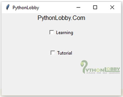
Example 1:
from tkinter import *

root = Tk()
root.title("PythonLobby")
w = Label(root, text='PythonLobby.Com', font="60")
w.pack()

Checkbox1 = IntVar()
Checkbox2 = IntVar()

Button0 = Checkbutton(root, text="Learning",
                      variable=Checkbox1,
                      onvalue=1,
                      offvalue=0,
                      height=3,
                      width=12)

Button1 = Checkbutton(root, text="Tutorial",
                      variable=Checkbox2,
                      onvalue=1,
                      offvalue=0,
                      height=3,
                      width=12)

Button0.pack()
Button1.pack()

root.geometry("320x220")
mainloop()
Output:
Methods
Below are commonly used methods for checkbutton widget: −
- deselect():
- flash()
- invoke()
- select()
- toggle()
1). Deselect: It clears or turns off the checkbutton.
2). Flash: It flashes the checkbutton a few times between its active and normal colors, but it leaves it the way it started first.
3). Invoke: We can call this method to get the same operation that has occured when the user clicked on the checkbutton to change its state.
4). Select: It makes active or turns on the checkbutton.
5). Toggle: It clears the checkbutton if set and turn to set if it is cleared.